Seemingly inconsequential features of packaging, like color, typeface, and label material, can deeply influence what we taste.
Next time you step into the grocery store, pay attention to the typeface. Look long enough, and patterns emerge. Sugary soda brands like Mountain Dew or Fanta love thick, heavy lettering, while wine companies play with handwritten script fonts to communicate their authenticity.
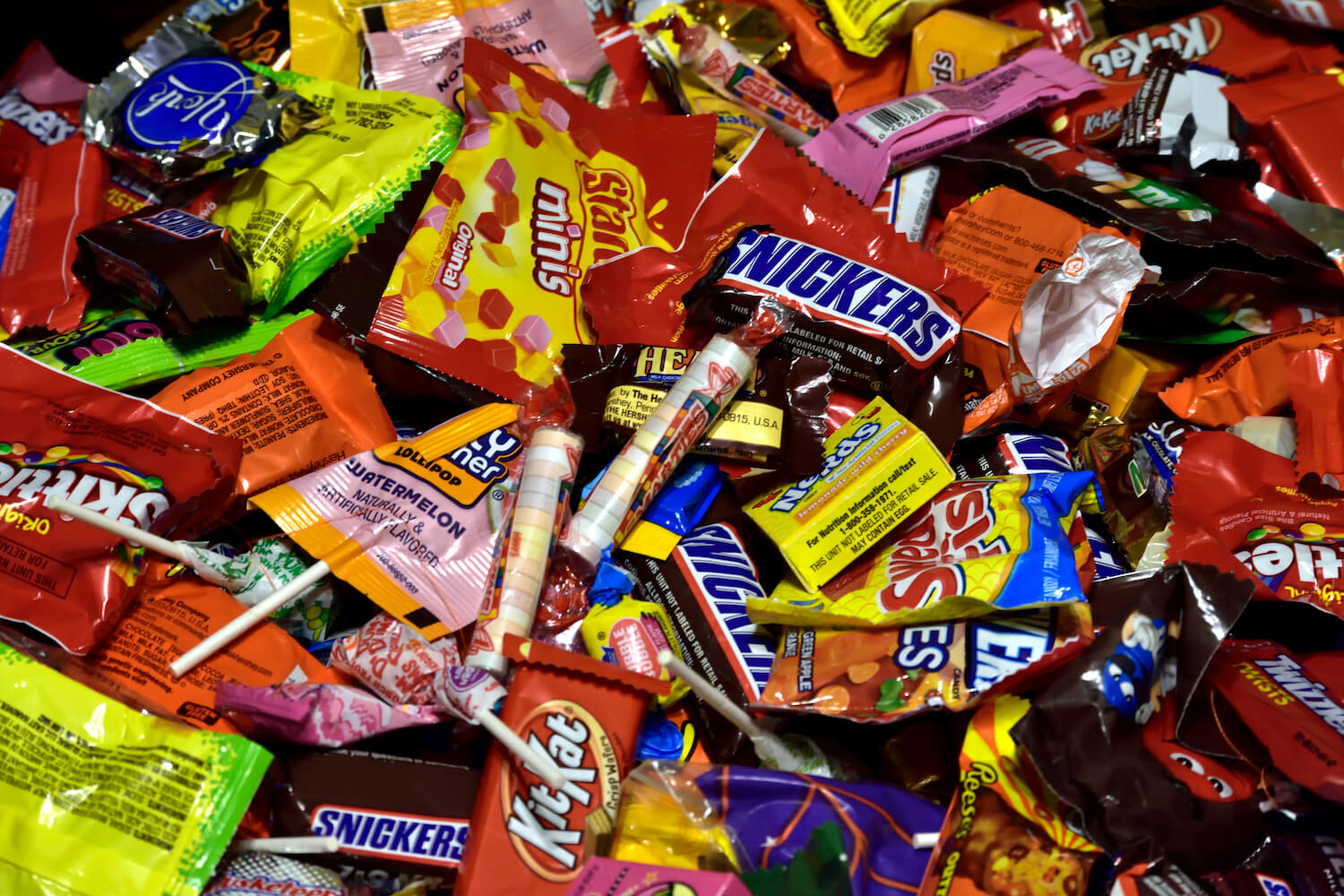
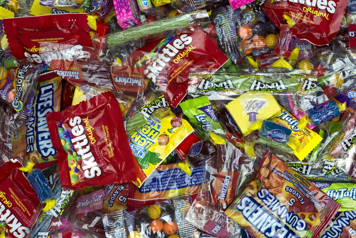
Turn to the candy aisle and the typeface gets rounder.
Take Airheads. There’s something off-kilter about the candy brand’s typeface. It’s thick, round, and a little bit bubbly, like the writing on a kid’s graphic novel. While other whimsy logo fonts still look restrained enough to appear on a Microsoft Word document, the Airheads lettering draws all the attention to itself.
Airheads thick, round, and bubbly typeface, resembles the writing on a kid’s graphic novel, drawing all the attention to itself.
Airheads
Most people wouldn’t pick up on these nuances, but Carlos Velasco does. A professor of marketing at the BI Norwegian Business School in Oslo, he has devoted years to studying how seemingly inconsequential features of packaging—like color, typeface, and sound—can recalibrate what we taste. He’s discovered that angular, asymmetrical fonts make us perceive foods as sour, while we tie round, symmetrical writing to sweetness. That cloud-like Airheads lettering? To your brain, it’s positively saccharine. “If there’s a case in which typeface clearly contributes to the taste, it is this one,” Velasco says.
You can see this phenomenon all across the candy aisle: Reese’s deploys fonts that look almost creamy. Starburst lettering seems to curl backward, like someone scrawled it across a sphere. On the flip side, companies selling sour candies—like Warheads or Brain Blasterz—package their products with far more angularity. The writing on Brain Blasterz, a line of sour candies and candy sprays, looks claustrophobic, with sharp angles on the “B” and“Z.”
Candy companies, with their eccentric fonts and sharp flavors, offer a clear illustration of a broader shift in grocery stores. Over the last two decades, food and drink packaging has become far more scientific—and companies have figured out how to use tiny details, like typeface, to guide what we taste.
“Simple designs and typefaces suggest transparency.”
For that, you can thank Oxford marketing professor Charles Spence, with whom Velasco has collaborated. In the early 2000s, Spence started asking questions about how our concept of taste interacts with other senses. One of his earliest fascinations involved sound. He started to explore how the crunch of a Pringle might impact its flavor. In one groundbreaking experiment, published in 2004, he found that a loud, high-pitched crunch led to a jump in customer satisfaction. Loud crunches made an otherwise identical chip seem 15 percent more fresh.
Spence discovered that people think coffee is almost twice as strong if served in a white mug versus a glass one. Because of a 2006 paper from Spence, Axe increased the audible volume of its spray deodorant, a shift that Spence suggested would convince male buyers that Axe has a stronger, longer-lasting scent.
[Subscribe to our 2x-weekly newsletter and never miss a story.]
Spence’s research knitted more closely together brands and psychologists who work in a field called “sensory marketing” or “neuromarketing.” Alcohol companies have become especially prolific collaborators with research firms, and for good reason: subtle shifts in typeface, color, and label material can mean the difference between a bottle of wine that looks like it should cost $10 and one that might go for $100. Last year, for instance, the winemaker Viña Santa Rita partnered with a neuromarketing firm on optimizing the company’s wine label. Among the findings: Labels with a bit of tactility around its font—think of a label with slightly raised lettering—make a bottle of wine seem more valuable than fully flat ones.
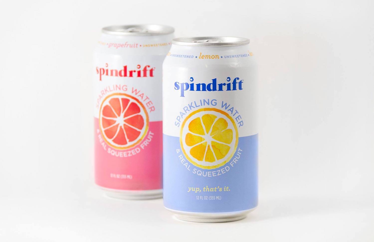
The Spindrift Sparkling Water typeface displays a skinnier serif logo with san-serif labeling. Consumers associate high-weight fonts with a more sugary drink.
Spindrift Sparkling Water
Velasco says he recently worked with a brand that sells sour beers. One problem it faced is that, in a crowded grocery case, customers can’t easily distinguish between sweet and sour beers. So when the company hired Velasco, he got his marching orders—help curate a label, typeface and all, that has “sour” written all over it. According to Velasco, that’s how these collaborations work. The brand comes in and announces, “‘Look, I want this typeface to emphasize this specific aroma.’ They come up with this kind of wishlist of things.”
Sensory marketing research has equipped companies with all sorts of new tactics. Academics have discovered that we think apple juice tastes better if it features a photo of an apple on the label. The same is true for orange juice; just the sight of a real fruit makes us believe the juice itself is fresh. People also taste rounded shapes as sweeter, which is why, when Cadbury started rounding the corner of its chocolate bars in 2013, some customers complained that the new chocolate bars now tasted “sickly” sweet—even though the actual ingredients hadn’t changed.
Typeface holds special intrigue because it’s so obscure. Few of us would imagine that our sudden hankering for something sour has any connection to the lettering in front of us. But once you notice it, you start to see the power of typeface everywhere. Compare the label of a trendy, low- or no-sugar drink brand like Spindrift or Izze against a more conventional alternative, and you might find that the latter’s typeface is much thicker than the former. Consumers associate high-weight fonts with a more sugary drink. Want to make your product seem like a low-cal buy? Pick a skinny serif for your logo.
“Within shape language, rounded forms typically communicate friendliness, approachability, and sweetness.”
Look at the diet version of any popular drink—say, Diet Coke or Diet Pepsi. On these labels, the word ‘diet,’ is “almost always in a smaller, lighter typeface than the original logo,” says Katie Lundin, a brand specialist at the design platform Crowdspring. One reason: “Simple designs and typefaces suggest transparency.” A thin font, we assume, has nothing to hide.
Other fonts have come to symbolize certain tastes less because of something inherent in their designs than because of general repetition. Sarah Hyndman, a graphic designer who hosts a series of experiments and explainers about the power of typeface at her website Type Tasting, has written about the singularity of fried chicken fonts. Almost all fried chicken shops have, like KFC, “flare-serif letterforms”—basically, fonts where the serifs on a given letter are thicker than the letter’s stem. Those fonts are also almost always red. The result: seeing that typeface conjures immediate associations with fried chicken.
So how consciously are companies really thinking about all of this when choosing the typefaces on their packaging? After Velasco noted Airheads as one of the most effective examples of typeface marketing, The Counter decided to reach out.
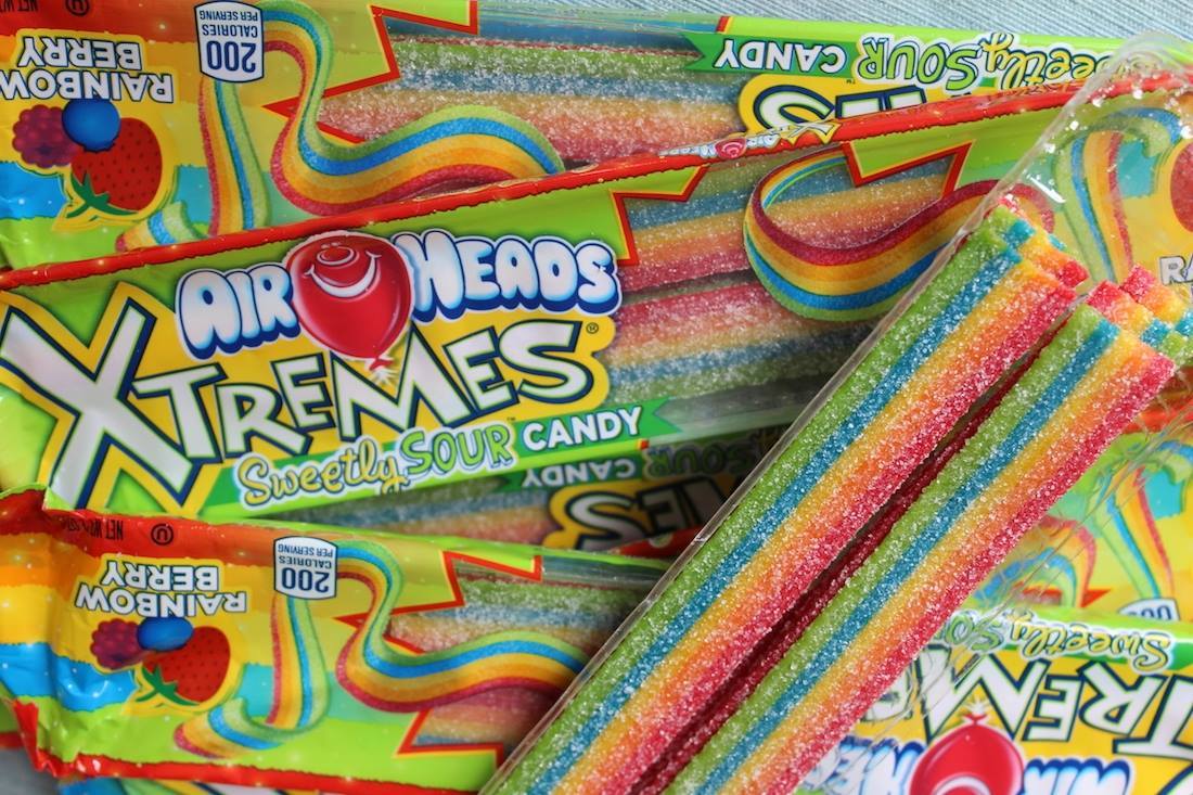
The Airheads Xtremes label uses bouncy fonts and hard-edged lettering to communicate a sour flavor expectation to consumers.
Airheads
Airheads works with COHO Creative, a Cincinnati-based branding firm, on its packaging designs. And Michael Buescher, a director of client experience at COHO, had an answer: “The power of visual language is real,” he said. “Within shape language, rounded forms typically communicate friendliness, approachability, and sweetness.”
COHO is very intentional about its use of typeface, including in its work with Airheads. Maybe the best illustration of this is Airheads Xtremes, the company’s sour option. On the Xtremes label, those bouncy fonts give way to hard-edged lettering, like on the Brain Blasterz logo. “More angular letterforms,” Buescher says, “communicate a stronger, sour flavor expectation, which is reinforced through the use of acidic colors.” (The Xtremes packaging is green- and yellow-hued.)
If you do celebrate a pseudo-Halloween this year, pay attention to those subtle changes in typeface from one candy wrapper to another. The font is going to influence what you taste—these companies have made sure of it.