Illustration by Tricia Vuong | Noun Project/iStock
A global group of designers and food thinkers are trying to create a new, universal symbolic language of abstract and sometimes ill-defined food concepts. It’s not an easy task.
This spring, a group of graphic designers, professors, and agricultural experts debated how best to distill the term “green chemistry”—a sprawling scientific field focused on designing products and processes that reduce pollution at its source—into a tiny, black-and-white icon. In the initial sketch round, a freelance designer had laid out four possible directions, featuring variations of a beaker filled with a bubbly liquid. In some, the designer added leaves to the rim of the beaker, which drew polarizing reactions from the reviewers.
One judge worried that the design felt illogical because “ecofriendly chemicals don’t actually sprout plants.” Another pointed out that, without any greenery involved, people wouldn’t have any way of understanding that the beaker was specifically for more sustainable chemicals. “To me, the design is not ‘sprouting plants’ but rather ‘abstractly helping plants,’” the other judge replied.
That same debate about how to adapt a complex agricultural concept into an easily identifiable visual symbol repeated across dozens of collaborative files. A cohort of designers submitted sketches representing over 400 terms, which ranged from basic allergens to micropropagation (the process of cloning many plants using a single original source). The work was part of the Foodicons Challenge, an international competition run by Douglas Gayeton, a filmmaker and writer focused on the intersection of design and sustainable food systems, and Nathan Shedroff, a sustainable design professor at the California College of the Arts. The competition challenges designers to create an open-access, visual language for the most prominent food and agriculture buzzwords.
The group has its work cut out for it. In recent years, especially among professionals concerned with sustainability, the food industry has been awash in discussions about how best to communicate to consumers the (often complex) value of certain agricultural practices, from pasture-raised meat to regenerative farming to holistic managed grazing. Many of these terms have precise definitions and don’t exactly lend themselves well to clean visuals. The Foodicons Challenge, which has sourced judges and designers from 80 countries, also aims to be international in scope: Each sketch that a designer proposes should be legible to more than just the population of a small handful of countries.
“I don’t want to oversell that the icon solves the problem necessarily, but the icon becomes the clue that keys people into, hey, that’s really similar to what we call this.”
“We’re trying to clarify, if not simplify, the vast number of terms out there that get thrown around,” said Shedroff, who is executive director for the project. He said that the current tangle of terms bouncing around the food industry has led people working toward similar, sustainable goals to “use different languages or different terms and not realize they overlap.”
Shedroff pointed to adaptive multi-paddock grazing, a type of cattle farming that is meant to better sustain plant growth, as an example. Adaptive multi-paddock grazing has more or less the same meaning as two other grazing-related terms, managed grazing and rotational grazing. “Very often they’re splitting a hair that doesn’t need to be split, which causes confusion not just among consumers but down the supply chain,” Shedroff said. Adding visual cues, he noted, will help link those conversations. “I don’t want to oversell that the icon solves the problem necessarily, but the icon becomes the clue that keys people into, hey, that’s really similar to what we call this,” he said.
Eventually, Shedroff hopes that the Foodicons symbols will be added to restaurant menus, buffet signage, retail food packaging, and to the boxes that are shipped from suppliers—farmers, fishermen, and so on—to their corporate buyers. Once the judges finish their critiques later this summer, all of the final icons will be posted to the Noun Project, a database of icons and logos popular among graphic designers. The group will also present them at the United Nations 2021 Food Systems Summit in September and to the World Food Forum in October.
But while Shedroff said he sees the icons that come out of the Foodicons Challenge playing a role largely in the business-to-business space—helping farmers better signal to their buyers, for instance, the sustainable histories of their produce—the group’s effort to create a visual standard for everything from allergens to livestock to soil types highlights a quirk of the food business: Restaurant menus and food packages are increasingly crammed with icons of their own, and most of the time, they mean a lot less than consumers think.
—
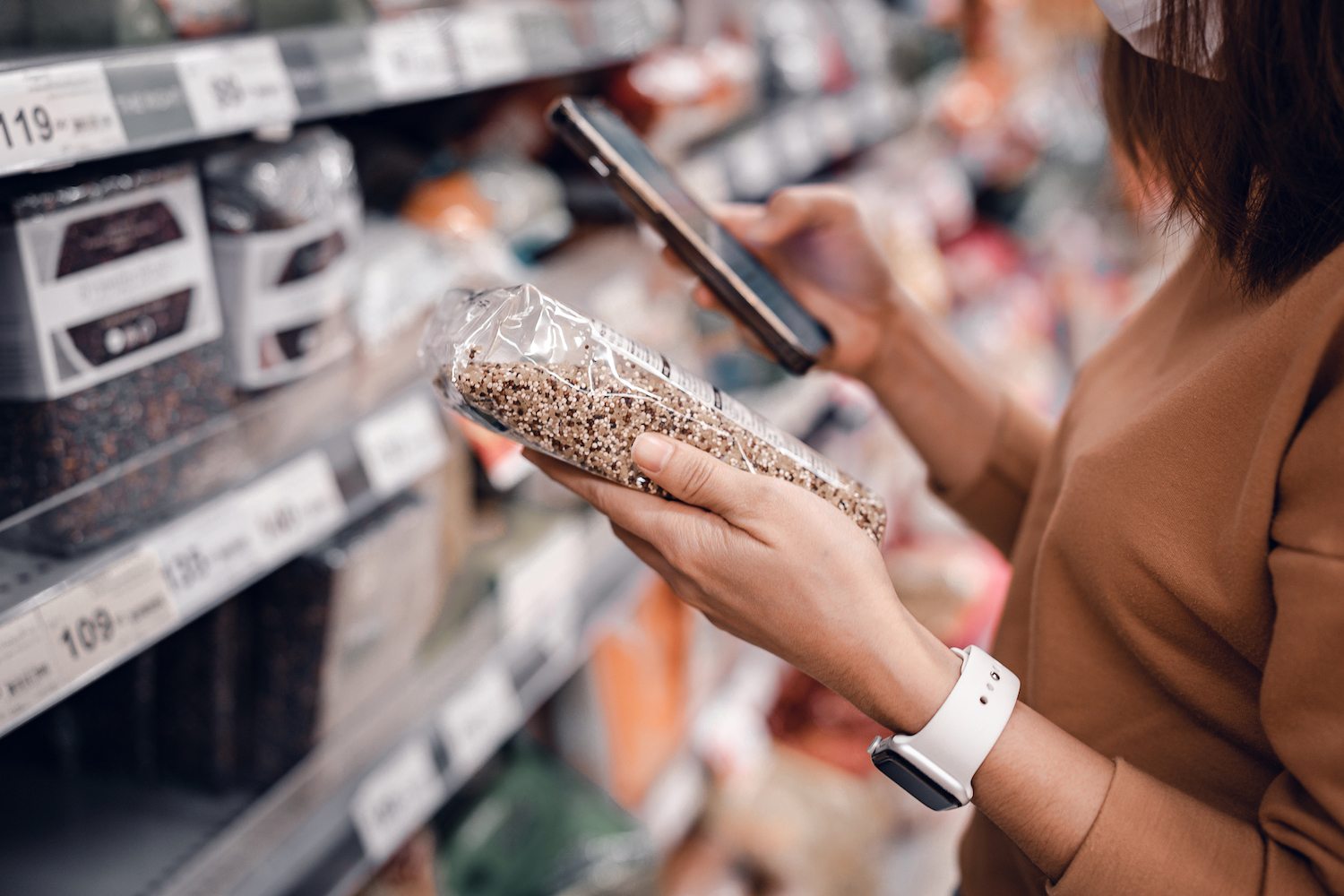
A slight majority of people with food allergies (55 percent) spend a whopping three to five minutes reading food labels for potential allergens.
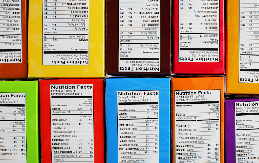
iStock/oatawaFood labeling is a massive business, involving not only regulators from the U.S. Department of Agriculture (USDA) and Food and Drug Administration (FDA), but also food manufacturers, designers, certification companies, and a network of consultancies helping companies to navigate the requirements.
Over the last decade or more, companies have increasingly adopted voluntary “ecolabeling” meant to certify the environmental performance of food and consumer products. The Marine Stewardship Council’s (MSC) Fisheries Certification, for instance, assesses fisheries based on a three-principle standard: sustainable fish stocks, minimizing environmental impact, and effective fisheries management. The MSC blue label bears the shape of a fish whose spine is also a checkmark and identifies a product as “certified sustainable seafood from an MSC certified sustainable fishery.” According to one estimate, there are now 455 ecolabels across the world.
Part of food labeling involves complying with regulation—disclosing any trace amount of the major allergens, for instance—and part of it is pure marketing, aimed at capitalizing on the public’s somewhat hazy understanding and strong desire to make a good, healthy, or sustainable choice. Companies might slap a “non-GMO” design onto the packaging for a box of cashews, even though no genetically modified cashews are currently on the market, or they might commission an icon that emphasizes their product is “natural,” a term with a vague enough USDA definition that even Cheetos has managed to claim, without challenge, that its products are “natural.”
For the most part, food labels today are text-based. Take allergens as an example: FDA only requires that allergens be listed out in writing, usually in the “Contains” section of the ingredient list on the back of a food package. That makes sense as a backstop, but it can also get complicated. A slight majority of people with food allergies (55 percent) spend a whopping three to five minutes reading food labels for potential allergens. And a growing pool of research has emphasized the role that visual elements, like a logo denoting hazelnut or soy, play in helping consumers more quickly identify allergens—not just on food packaging, but also on restaurant menus, in bakeries, and in school cafeterias.
“Standards are hard. Some people have problems seeing red or green. An icon might be an insult in another part of the world.”
One 2018 study concluded that consumer purchase decisions “are mostly based on graphics and to a lesser extent on information and form” on food packaging. A paper from June 2020 found that consumers thought icon-based allergen labels were more useful than their text-based counterparts, a finding that was especially true among “users who are travelling internationally or are non-fluent in their local language.”
Yet despite their promise, allergen icons—like food-based icons all across the industry—don’t have uniform designs, potentially muddling their overall effectiveness. “It’s hard to dictate a top-down icon for every company in the world,” said Klaus Fuchs, the director of industry collaborations at the Swiss university ETH Zürich, who conducted the icon-based allergen study. A few trade groups, like the International Association for Food Protection, have rolled out some of their own public-source icons in a bid to make them more accessible to food packagers, restaurants, and other distributors, but it isn’t clear to what extent they have caught on.
Others have proposed as solutions everything from QR codes that pull up digital allergen icons to emojis. In 2015, an engineer at Google named Hiroyuki Komatsu suggested that the Unicode Consortium—the organization that oversees the emoji library and approves new emojis for use—create emojis for the major allergens, so that food companies could have a clear way to mark them on websites and online menus. (The application was never approved.) But, said Fuchs, “standards are hard. Some people have problems seeing red or green. An icon might be an insult in another part of the world.”
The Foodicons icons, which include a set of visual symbols for 16 major allergens, could at least begin to unify what, say, a hazelnut icon should look like on food packaging or on a restaurant menu.
In general, when companies want to add icons to their products, they still hire out individual artists to do it. Sofia Ayuso, a graphic designer who has created hundreds of food-based icons for hotels and airlines, said that crafting a set of icons is tricky because each has to share common attributes so that they mesh together, while also remaining easily identifiable. “The challenge there is how to make them simple and universally recognizable and at the same time respect the rules of that icon family,” Ayuso said.
The Foodicons icons, which include a set of visual symbols for 16 major allergens, could at least begin to unify what, say, a hazelnut icon should look like on food packaging or on a restaurant menu. The idea is that, if these icons become prevalent enough, consumers or distributors will be able to recognize them from a single glance. But it’s hard to imagine the project taking off to the point where it can approach anything close to a standard.
—
If a single icon has made the full transition from product packaging into social ubiquity, it’s the recycling symbol. The looping triple-arrow design, which today people across linguistic boundaries understand without more than a stray look, started in a similar way to Foodicons: with a contest, in 1970.
The Container Corporation of America, then the largest American manufacturer of corrugated boxes, was devising ways to promote its recycling efforts to consumers. By that point, it claimed that roughly 53 percent of its products were using recycled fibers, and it wanted people to know about it. To spread the word, the company decided to create a symbol that it could display on all of its boxes—something that, over time, could become inextricably tied to recycling. It decided to crowdsource designs to high school and college students across the country. “The purpose of the contest is to obtain a symbol that will readily identify packages made from recycled or recyclable materials, to remind concerned citizens that recycling is conservation,” the company wrote in its initial ad in May 1970.
By that summer, after sorting through hundreds of applications, the Container Corporation declared a winner: It awarded a University of Southern California student named Gary Anderson $2,500 for his triple-arrow design. Soon after the Container Corporation started adding Anderson’s icon to its boxes, a coalition of paper industry trade groups approved its use, too. The Container Corporation began licensing the symbol out for a small fee. By early 1971, newspapers hailed the new “clockwise arrow” symbol, though they were also quick to clarify to people unfamiliar with its meaning that “the arrows seemingly chasing each other don’t command you to drive your car in a circle.” As interest in the new symbol ballooned, the Container Corporation filed a petition to trademark it. Only after environmental groups fought back did the company back off, setting the stage for the recycling symbol to achieve the open-source symbol ubiquity it enjoys today.
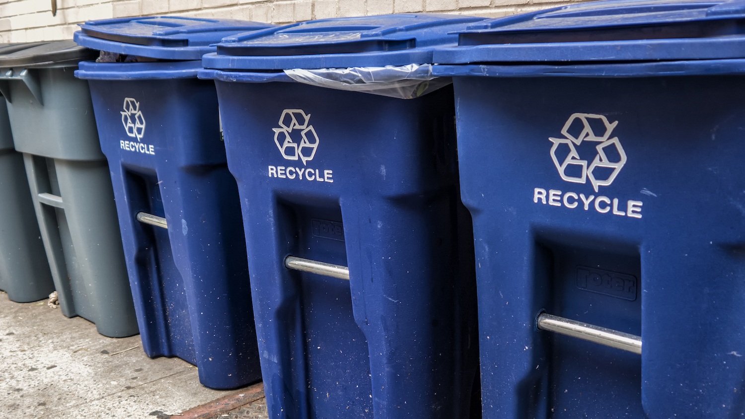
Factions within the plastic industry were quick to realize that, by slapping the recycle symbol onto their products, they could make consumers think that their products were more likely to be recycled than they actually were.
But while the recycling symbol showcases the power of an icon to drive consumer awareness of a sustainable process, that approach of putting out a design and democratizing access—with no organization vetting it—has its pitfalls. For one, factions within the plastic industry were quick to realize that, by slapping the symbol onto their products, they could make consumers think that their products were more likely to be recycled than they actually were. In 1991, a group of 11 states accused the industry of duping customers into recycling products that could not be recycled. While the industry claimed that the symbols were codes specifically for manufacturers, meant to differentiate types of plastic, NPR uncovered an internal memo in 1993 that warned plastic executives they were creating “unrealistic expectations” among consumers about what could be recycled.
It is, in some ways, a cautionary tale. But today, the lasting popularity of the recycling icon has spawned a new crop of organizations attempting to mimic its success—and, in doing so, raise awareness for their own causes. These days, when an organization wants to promote a dietary restriction, farming practice, or sustainable approach to production, they create an icon for it. Organizations from Vegan Action to the Whole Grain Council to the American Heart Association have various food certification programs, where companies can submit their products to be vetted as vegan or GMO-free or heart healthy; if they pass, they can add that group’s icon onto the front of their packaging.
More certification programs pop up every year. At least four groups are currently working to create certifications for regenerative farming, for instance. One of them is Regenerative Organic Alliance, an organization founded in 2017 with support from the activist clothing company Patagonia and the producer of personal care products, Dr. Bronner’s. The group’s executive director, Elizabeth Whitlow, said that she intends the Regenerative Organic certification to go beyond organic labeling, which itself has been watered down in recent years, and factor in soil health, animal welfare, and social equity for farm workers.
While the existence of a regenerative icon does not necessarily portend a structural rethinking of agriculture, it can put some pressure on companies to rethink how they approach farming.
The challenge for many new certification groups is convincing companies to submit their products for review. To achieve even a fraction of the success of the recycling symbol, icons have to create a flywheel effect: Once they gain enough traction, the symbols not only become coveted among companies trying to differentiate their products from rivals—they also, in theory, spread consumer awareness of the sustainable processes that a group like the Regenerative Organic Alliance was set up to promote. If brands en masse start showcasing a regenerative farming label on their products, the idea is that the public eventually learns to look for that label on more of the products they buy.
While the existence of a regenerative icon does not necessarily portend a structural rethinking of agriculture, it can put some pressure on companies to rethink how they approach farming. “It’s not a perfect solution, but it is a solution to help drive change to very broken systems,” Whitlow said, adding that brands like Nature’s Path and Lotus Foods have already received Regenerative Organic certification.
Most certification groups charge nominal annual fees, usually in the hundreds or low thousands, to approved companies that want to use their designs. That is likely negligible for a large brand that wants the marketing boost from an American Grassfed label—but it might keep small businesses from submitting their goods to be certified. “Those are costly on a whole other level because now you have to pay for certification, you have to pay for the use of those icons,” said Nathan Shedroff of the Foodicons Challenge. The eventual icons his project generates, he pointed out, will be free to use.
The problem, though, is that it’s easy for companies to use these labels while avoiding certification altogether. A group called the Non-GMO Project, for instance, offers its GMO-free icons in the form of its Non-GMO Project Verified label to products that it verifies to be truly GMO-free. But companies that don’t want to go through the Non-GMO Project’s vetting process can—and do—simply design their own “GMO-Free” or “GE-Free” labels, which are not verified by third parties. Whitlow said that this was a concern for the Regenerative Organic Alliance as well. The group was quick to trademark its icon, she said, because “they wanted to keep integrity in the claim, and they wanted to keep it very high bar and not let it get watered down and greenwashed.”
“I think the sponsorship of these labels matters. Their primary motivation is to help their members sell more product, to support their industry, and so their motivations are much more narrowly directed than are government agencies or government entities.”
Yet it is not always clear to consumers, on first glance, when a label’s claims are vetted and when they are not. The American Grassfed Association certifies its “Grassfed” label when livestock is fed only grass and forage. The organization has its own standards, and its investigators follow up every 15 months with products that use its icon. “Free Range,” by contrast—a staple of many egg cartons—has no federally-regulated definition and no third-party organization to vet company claims. The United Egg Producers, a cooperative of U.S.-based egg farmers, has a “UEP Certified Cage-Free” label that it vets, but it isn’t uncommon to see companies marketing their products as “cage-free” without a seal of approval from any outside group. Companies usually commission their own designs when they want to add a “cage-free” logo to their packaging.
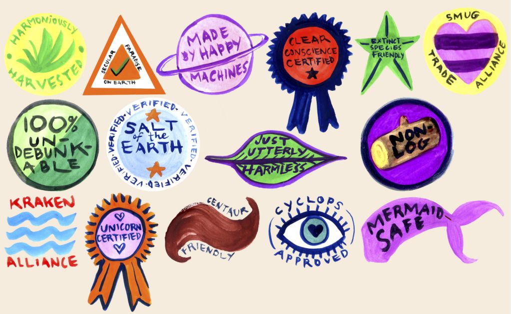
The result is an awkward patchwork of icons, whose designs are only partially standardized and whose claims may or may not have the endorsement of a specialized organization. Some icons, too, mean essentially nothing at all: The marketing researcher Rumaila Abbas tracked the rise of the heart icon, which pops up on the packaging for everything from Cheerios to pomegranate juice, and is meant to indicate that consuming those products can help protect you from heart disease, without making any particular claim.
Even labels that do technically go through a certification process can vary widely in terms of their rigor. In a 2017 paper, Nicole Darnall, a professor at the School of Sustainability at Arizona State University, segmented ecolabels into three distinct camps: those sponsored by government, industry, and independent organizations. Darnall found that industry-sponsored ecolabels tend to have weaker rules than those created by independent, third-party groups. “I think the sponsorship of these labels matters,” said Darnall. For industry-created certifications, oftentimes “their primary motivation is to help their members sell more product, to support their industry, and so their motivations are much more narrowly directed than are government agencies or government entities.”
Companies learn how to appropriate symbols quickly. Just introducing a new suite of icons does not mean they will be used as intended.
That doesn’t mean industry-sponsored certification programs are meaningless. Darnall said, “I would say they are probably better than nothing, but if you are looking at a robust ecolabel, industry ecolabels are not the silver bullet.” And there is negligible oversight of these claims. If an ecolabel proves to be truly misleading, the Federal Trade Commission (FTC) is empowered to fine the companies that add them to their products. But, Darnall said, “the fines that are imposed are small and they’re infrequent,” giving industry groups more space to make dubious sustainability claims.
Companies learn how to appropriate symbols quickly. Just introducing a new suite of icons does not mean they will be used as intended. But in the best scenario, they could, at least, usher a process like regenerative farming into the mainstream the way the three-arrow logo did for recycling.
One problem Darnall highlights is that submitting products to a certification program is voluntary for companies. “That means the vast majority of companies will never volunteer themselves into the system,” she said. Customers can only see the rosy side of a company’s sustainability efforts—not the failures. She is advocating for a move toward a “universal food label,” where all food products are vetted and rated, and audits are made public whether or not companies pass them.
That new standard, while radical, may not be far off. In June, the U.K. government—in conjunction with an organization called Foundation Earth—announced it was testing a new food labeling system that measures the sustainability of a given product’s supply chain. Under the system, all food products are vetted and scored, from A to G, according to the sustainability of their supply chain—meaning that even products with a heavy carbon footprint will have that fact added to their packaging, whether the makers want it to be there or not.
The Foodicons Challenge doesn’t have the same teeth, and it isn’t designed to. Once Foodicons publishes its suite of icons later this summer, we’re not likely to see symbols for “green chemistry” and “micropropagation” nestled alongside “Kosher” and “Grassfed” on packaging for sliced bread or cleaning supplies. There is only so much room on a cafeteria billboard or a CPG package for visual designs. But the project, in trying to create a more universal standard, does underscore just how complicated and opaque the world of food marketing truly is—and how much responsibility for investigating label claims falls to us, the eaters.

